Red House Watercolor Painting
Part of The Solitude Collection
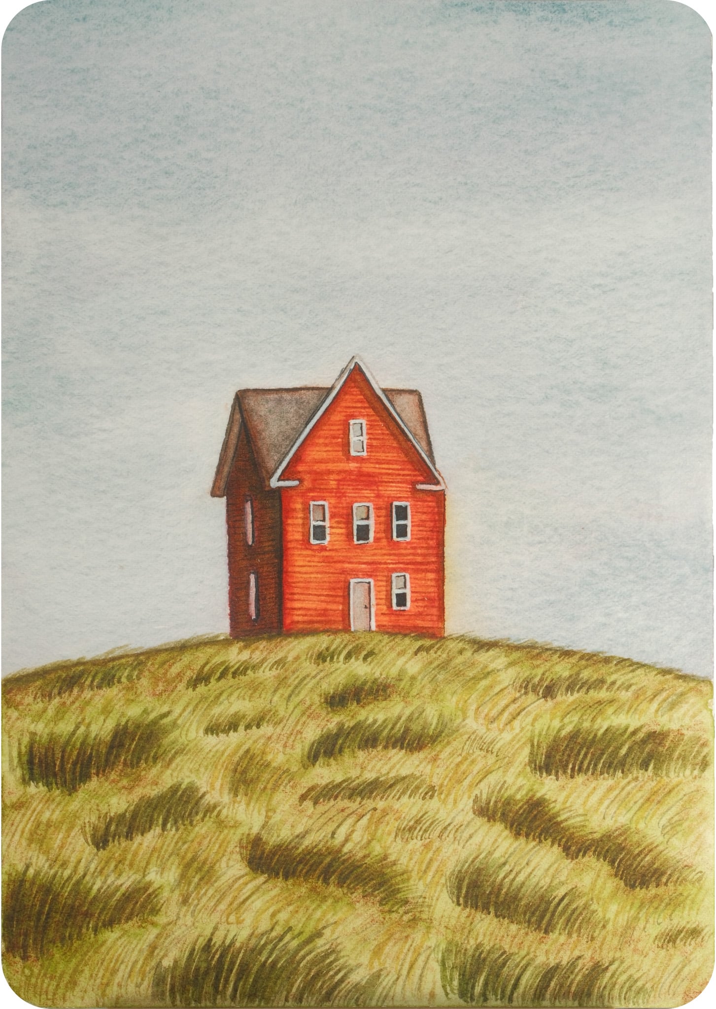
This postcard is part of the same watercolor series where I explore simple houses placed in open landscapes. I’m really drawn to this kind of composition—just a single structure and a lot of space around it. It creates a quiet, almost meditative feeling.
In this piece, I chose a red house because I wanted something warmer and more contrasting against the soft greens and muted sky. The hill is intentionally textured with loose, repetitive strokes to suggest movement in the grass without over-detailing it.
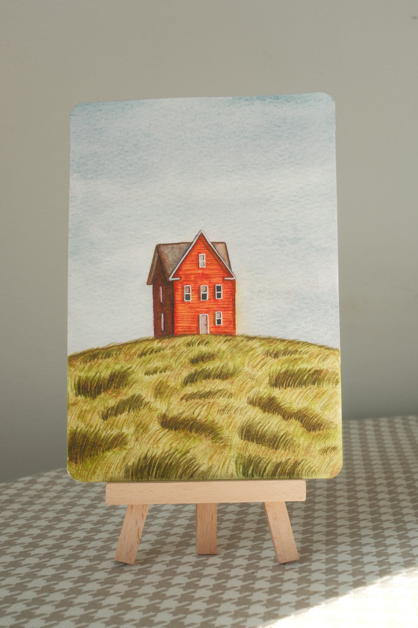
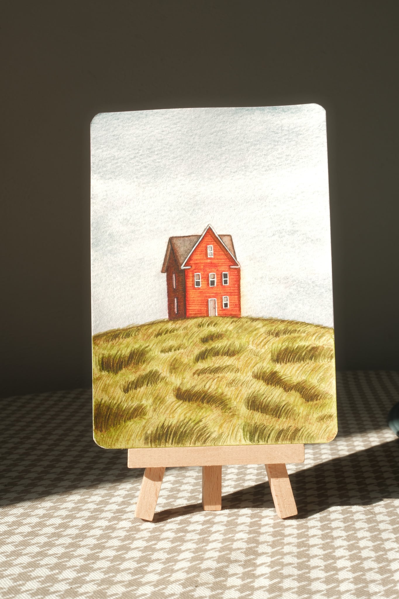
One thing I really love about watercolor—and something you can see clearly in these photos—is how much the artwork changes depending on light. The same painting can feel softer, warmer, or more contrasty just from a different angle or time of day. The pigments interact with the paper and light in a way that’s hard to fully control, and that’s exactly what makes it interesting to me.
Working in postcard format keeps everything focused. It forces me to simplify, to choose only what really matters in the scene. This piece, like the others in the series, is about atmosphere, color balance, and that quiet feeling of being somewhere open and still.
Contact me to get your own watercolour painting